QR codes are everywhere—from product packaging to posters and menus. But just because a code is visible doesn’t mean it’s scannable. To get real results, you need to follow the best practices for QR code legibility. This ensures your codes are clear, high quality, and easy to scan on any device, in any environment.
Whether you’re using dynamic QR codes, which offer the flexibility to edit content and track QR code scans, or static QR codes for simpler, one-time uses, maintaining QR code legibility is key. It’s also crucial that every QR code leads to a mobile-optimized page, enhancing user experience, increasing brand recall, and boosting your QR code leads. This guide will explore how to design, place, and print high quality QR codes that are reliable, easily scanned, and effective across various real-world scenarios.

Designing QR codes for legibility
Designing QR codes for legibility is one of the most important steps to ensure that people can easily scan a QR code and access your content. A well-designed QR code isn’t just about looks — it can mean the difference between a successful marketing campaign and a missed opportunity to connect with your target audience.
Color and contrast: Best practices for QR code design
When designing QR codes, paying close attention to color and contrast is critical for ensuring reliable scanning across different devices and environments. A QR code with high contrast between its foreground and background colors is far more likely to be scanned quickly and successfully. Here are some best practices for color and contrast in QR code design:
- Use a light-colored background with a darker foreground color: Sticking to a traditional white background and dark code ensures maximum contrast, making it easier for a qr code scanner to detect and read your QR code.
- Avoid using colors that are too similar: Shades that are too close together can reduce contrast and make the QR code harder to scan. High-contrast color combinations help ensure readability and reliable scanning.
- Use a color scheme consistent with your brand identity: While maintaining strong contrast, you can still customize QR codes using your brand’s colors to keep the design both visually appealing and on-brand.
- Avoid using too many colors: Overcomplicating the color palette can create visual clutter, making it harder to scan the QR code. A clean, simple design improves scannability and brand recognition.
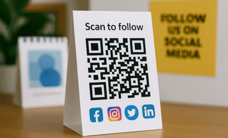
Logo and branding: How to incorporate logos into QR codes
Adding a logo to your QR code is a great way to reinforce brand recognition while still ensuring readability. Here are some best practices for incorporating logos into QR codes:
- Use a simple and recognizable logo: Choose a logo that’s clear even at small sizes so it doesn’t interfere with the QR code’s scanning performance.
- Ensure the logo is not too large: An oversized logo can block important parts of the quick response code, reducing its scannability. Keep the logo size modest and well-centered.
- Maintain consistency with your brand identity: Your QR code design should feel like a natural extension of your marketing material, helping improve brand recall when people scan a QR code.
- Avoid using multiple logos: Placing two logos or more inside a QR code adds unnecessary complexity. Stick with one well-positioned logo for the best balance between design and functionality.
How to make QR codes more readable
When designing QR codes, readability should always come first. Even the best-looking QR code won’t deliver results if people struggle to scan it. No matter how clever the design or strategic the placement, poor legibility means fewer QR code scans — and lost opportunities. Here are the key best practices for improving QR code legibility:
Use the appropriate QR code size
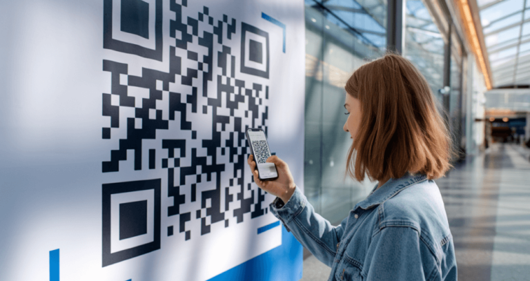
The size of the QR code has a direct impact on how easily it can be scanned. A general rule of thumb is to keep the minimum size at 1 x 1 inch (2.5 x 2.5 cm), which works well for most mobile devices. But depending on the scanning distance and the surface where you place the QR code, larger dimensions might be needed.
For example, if you’re printing QR codes on billboards, posters, or other marketing collateral viewed from farther away, you’ll need to scale up the size significantly to ensure reliable scanning. Always match the QR code size to the expected scanning distances and physical environment.

Maintain a quiet zone
The quiet zone — the empty white space surrounding a QR code — is just as important as the code itself. This area helps a QR code scanner quickly detect where the code starts and ends. A good rule is to make the quiet zone at least four times the width of one black module in the QR code.
Skipping the quiet zone can cause the code to blend into backgrounds or other design elements, making it harder to scan. Also, avoid placing two QR codes too close together, as multiple QR codes in one spot can confuse scanners and disrupt the user experience.
Ensure high contrast between the code and background
Color plays a major role in making QR codes easily scannable. High contrast between the QR code and its background is critical. Traditional black-and-white QR codes remain the gold standard for a reason: they’re simple, high contrast, and reliable.
If you want to customize QR codes with brand colors, that’s fine — just make sure there’s a strong enough color contrast. A white background paired with a darker code is the safest choice for ensuring quick response and reliable scanning across multiple devices.

Choose error correction levels wisely
One of the reasons QR codes are so powerful is their built-in error correction capability. Even if a QR code gets scratched, smudged, or partially obscured, it can still be scanned thanks to error correction levels.
Choosing the right error correction level depends on your project. Higher error correction levels (like Level Q or H) add more redundancy, improving the chances of a successful scan even if part of the code is damaged. However, they also make the QR code denser, which means you may need a larger QR code size to maintain easy readability.
How do I make my QR code better quality?
Creating high-quality QR codes is critical if you want your marketing campaigns to succeed. Quality isn’t just about how a QR code looks — it’s also about how well it performs when people scan it in the real world. Here’s how you can enhance both the visual appearance and functionality of your QR codes:
Use vector formats for printing
When printing QR codes, always use high quality images in vector formats like SVG, EPS, or PDF. Vector files prevent pixelation and distortion, keeping your QR code crisp and scannable across different sizes and types of marketing material. A pixelated or blurry QR code increases the risk of scanning errors, which can hurt engagement and lead to lost potential customers.

Optimize for multiple devices
People scan QR codes using a wide range of mobile devices, each with different camera qualities and QR code scanner apps. To make sure your QR code works for everyone, test it on various smartphones and tablets, under different lighting conditions, and at varying scanning distances. Reliable scanning across multiple devices is key for maximizing QR code leads and ensuring a great user experience.
Account for scanning distances
The ideal size of the QR code depends heavily on where you place it and how far people will be when they scan. A QR code on a product label needs to be small and sharp for close-range scanning, while a QR code on a banner or billboard must be much larger to allow reliable scanning from several meters away.
Always adjust the size of the QR according to the expected scanning distance and the type of marketing collateral you’re using. Matching QR code dimensions to real-world usage ensures better readability and more successful scans.
Avoid visual clutter
Nothing kills the effectiveness of a QR code faster than visual clutter. Busy backgrounds, loud patterns, or too many design elements around the code can confuse scanners and make the code harder to detect.
For best results, place QR codes on plain, high-contrast backgrounds with plenty of clear space around them. A clean layout not only makes it easier for people to scan the QR code, but also enhances the overall look of your marketing material, boosting brand recall.

Advanced practices for QR code legibility: maximizing visibility and effectiveness
Now that we’ve covered the fundamentals of QR code design and readability, it’s time to explore more advanced strategies. Whether you’re placing QR codes on product labels, marketing collateral, or physical spaces, following these best practices will maximize visibility, drive more QR code scans, and ensure a smooth experience for potential customers — no matter the environment or device they use.
Consider different surfaces for QR code placement
Not every surface behaves the same when it comes to placing QR codes. The type of material, its shape, and even its texture can impact how well a QR code scans. Here’s what to keep in mind:
- Product labels: Always place QR codes on a flat, smooth area of the product to avoid folds, seams, or distortions that can affect scanning. Adjust the QR code dimensions so that they fit naturally on the label but stay large enough for easy scanning, even on small packaging.
- Marketing materials: Whether you’re printing QR codes on posters, flyers, or brochures, positioning matters. Place QR codes in highly visible, easy-to-reach spots — ideally at eye level or prominently on the front page. Good placement increases scan rates and strengthens your marketing campaigns.
- Different surfaces: Curved surfaces, like bottles or cylindrical packages, can warp the QR code if not handled carefully. To compensate, consider increasing the size of the QR code slightly so it remains readable even with surface curvature. Testing the scannability after printing is essential to avoid surprises in the real world.

Adapt QR codes for different lighting conditions
Lighting has a huge impact on how easily people can scan a QR code. A QR code that scans perfectly indoors under controlled lighting might struggle outdoors in harsh sunlight or low-light environments. Here’s how to adapt your QR codes to perform well no matter the setting:
- Direct sunlight: If you’re placing QR codes outdoors, avoid printing them on glossy or reflective surfaces. Glare from direct sunlight can make it harder for mobile devices to detect the code. Instead, choose matte finishes to reduce reflections and improve the chances of a successful scan.
- Low-light environments: For venues with dim lighting — like indoor events, nighttime festivals, or certain retail spaces — maximize the contrast between the QR code and its background. A high-contrast, bold design ensures that people can still scan the QR code quickly even when lighting is less than ideal.
Use dynamic QR codes for flexibility
Dynamic QR codes offer flexibility that static QR codes simply can’t match, making them a powerful tool for marketing campaigns. Here’s why dynamic QR codes are a great idea:
- Tracking QR code scans: Dynamic QR codes allow you to track how many people scan the QR code, when they do it, and even what devices they use. This data is invaluable for measuring customer engagement and refining your marketing strategies.
- Customizing QR codes for marketing campaigns: Dynamic QR codes are easy to customize with your brand’s colors, logos, and design elements — without sacrificing scannability. Just remember to test the customized QR code across multiple devices to ensure it still scans reliably before rolling it out across your marketing collateral.
Plus, with dynamic QR codes, you can update your links or landing pages anytime without needing to reprint new codes, saving time, resources, and maintaining campaign momentum

Ensure high-quality printing for physical QR codes
Printing QR codes isn’t just about getting the design right — the print quality itself can make or break a QR code’s scannability. To ensure your codes work flawlessly in the real world, follow these best practices:
- High-quality images: Always use vector file formats like SVG or EPS when printing QR codes. These formats keep the code sharp and readable at any size, whether you’re printing on product labels, brochures, or large marketing collateral.
- Account for external factors: Physical QR codes are exposed to the elements — direct sunlight, rain, dirt, and wear. To protect your codes from fading, smudging, or damage, consider using laminated finishes or coatings. This helps ensure the QR code remains legible and scannable over time, especially for outdoor or high-traffic environments.
Keep QR codes scannable on multiple devices
Not all mobile devices scan QR codes equally. Cameras, screen sizes, and scanner apps vary widely, so it’s important to test your QR code across multiple devices. Try scanning with different operating systems, screen resolutions, and apps to ensure reliable scanning performance.
By testing broadly, you can confirm that your QR code is easily scannable for a wide range of users — boosting QR code leads and improving the overall success of your campaign.
Take advantage of error correction levels
As mentioned earlier, QR codes include error correction capabilities that allow them to function even if a portion is damaged, smudged, or partially blocked. There are four error correction levels:
- Low (L)
- Medium (M)
- Quartile (Q)
- High (H)
If your QR code will be placed in areas where damage is likely — such as packaging, outdoor signage, or heavily handled materials — choose a higher level like Q or H. Just keep in mind that more error correction makes the QR code denser, so you may need to increase the size of the QR code to maintain legibility.
Avoid using overly complex design elements
Customizing QR codes with brand colors, logos, or patterns can be a great idea — but overdoing it can hurt scan performance. Intricate designs, multiple overlapping colors, or busy backgrounds can make the code harder for scanners to recognize.
Always prioritize readability over aesthetics. Keep your design simple, use high contrast, and test the QR code thoroughly before publishing. A clean, functional design will consistently deliver better results and ensure your QR code remains scannable across different devices and conditions.

Place QR codes in strategic locations
When it comes to using QR codes effectively, location matters. Where you place the QR code can have a huge impact on how many people actually scan it. Always position QR codes in visible and easily accessible areas where they naturally catch the eye of potential customers.
For example, putting QR codes on the front page of brochures, at eye level on posters, or at the top of product labels increases the chances of people noticing and scanning the QR code. Good placement removes barriers and invites quick engagement — a key factor in successful QR code campaigns.
Provide clear instructions for scanning
Not everyone instantly knows how to scan a QR code, especially if they aren’t tech-savvy. Including simple, friendly instructions next to the QR code can dramatically improve scan rates.
Phrases like “Scan the QR code for more information” or “Point your camera here to learn more” guide users and encourage them to take action. A little nudge can make the difference between a QR code that gets ignored and one that drives real engagement.
Test, test, test!
Before launching any campaign involving QR codes, testing is absolutely essential. Don’t assume your QR code will work everywhere just because it scanned fine on your phone once.
Test the QR code across a variety of mobile devices, lighting conditions, surface types, and scanning distances. Try it indoors, outdoors, under direct sunlight, and in low light. Checking how your QR code performs under real-world conditions lets you catch potential issues early and make adjustments to guarantee maximum readability and reliable scanning.
Creating effective QR code campaigns
Building an effective QR code campaign takes more than just printing a code and hoping people will scan it. It requires thoughtful planning, clear goals, and smart execution. Here are some key tips to help you create QR code campaigns that truly deliver results:
Determining the purpose of QR code use
Before you dive into designing or printing anything, take the time to define why you’re creating the QR code in the first place. Answering a few critical questions will set the foundation for a successful campaign:
- What is the goal of the QR code campaign?
Be clear about what you want to achieve — whether it’s driving traffic to a landing page, offering product information, collecting leads, or boosting customer engagement. - Who is the target audience for the QR code campaign?
Knowing your audience helps you tailor the content, design, and QR code placement to match their habits and preferences. A QR code aimed at busy commuters, for example, needs different placement than one targeted at event attendees. - What type of content will the QR code link to?
Choose content that’s highly relevant, valuable, and mobile-friendly. Whether it’s a product page, a video tutorial, or an exclusive offer, make sure it rewards the person who takes the time to scan the QR code. - How will the QR code be distributed and promoted?
Plan carefully where and how you’ll place the QR codes to maximize visibility. Think about marketing materials, physical spaces, and even product labels that your target audience will naturally encounter.
By answering these questions upfront, you’ll be able to design a QR code campaign that’s strategic, user-focused, and much more likely to hit your marketing goals.

Conclusion: Best practices for QR code legibility
QR codes offer a simple but powerful bridge between the physical and digital worlds — but only if they are easy to scan. Following the best practices for QR code legibility covered in this guide — from choosing the right QR code size and maintaining a proper quiet zone to optimizing color contrast and accounting for external factors — ensures your codes are always ready to engage your target audience.
Whether you’re working with static QR codes or leveraging the flexibility of dynamic QR codes, investing time in designing, placing, and testing QR codes pays off with better scan rates, smoother user experiences, and stronger marketing results.
By prioritizing high-quality printing, adapting your QR codes for different environments, and thinking carefully about placement and readability, you can create high quality QR codes that drive real-world action and improve every stage of the customer journey. These best practices are essential for any brand or business aiming to make QR codes a truly effective part of their marketing strategy.