Transparent QR codes: how to put a code on artwork without the white box

What is a transparent QR code?
A transparent QR code is a QR code exported without its background. Instead of a white square with a black grid inside, you get a PNG with an alpha channel or an SVG where only the modules are drawn. Place it on a coloured layout and the colour shows through the gaps.
That solves the most common complaint designers have about QR codes: the white box. It does not solve the second one. The modules are still solid, still one fixed colour, and the moment the background behind them stops being pale and even, the contrast breaks and the code stops scanning.
Removing the white box is not the same as making the code belong to the design.
Transparent, invisible and standard: the difference that matters
Three terms get used interchangeably, and the difference decides whether your code survives the print run.
| Standard QR code | Transparent QR code | Invisible QR code | |
|---|---|---|---|
| Background | Solid white plate | None (alpha channel) | None (alpha channel) |
| Modules | Solid black squares | Solid squares, one fixed colour | Semi-transparent dots with a contrast halo |
| Adapts to the artwork | No | Partly, one colour for the whole code | Yes, each dot takes its tone from what is behind it |
| Over photographs or busy art | Works, but as a box | Risky, contrast breaks | Works, the halo keeps contrast per dot |
| Corner markers | Solid | Solid | Solid outline |
| Best for | Receipts, forms, documents | Flat, light, single-colour layouts | Packaging, posters, covers, murals |
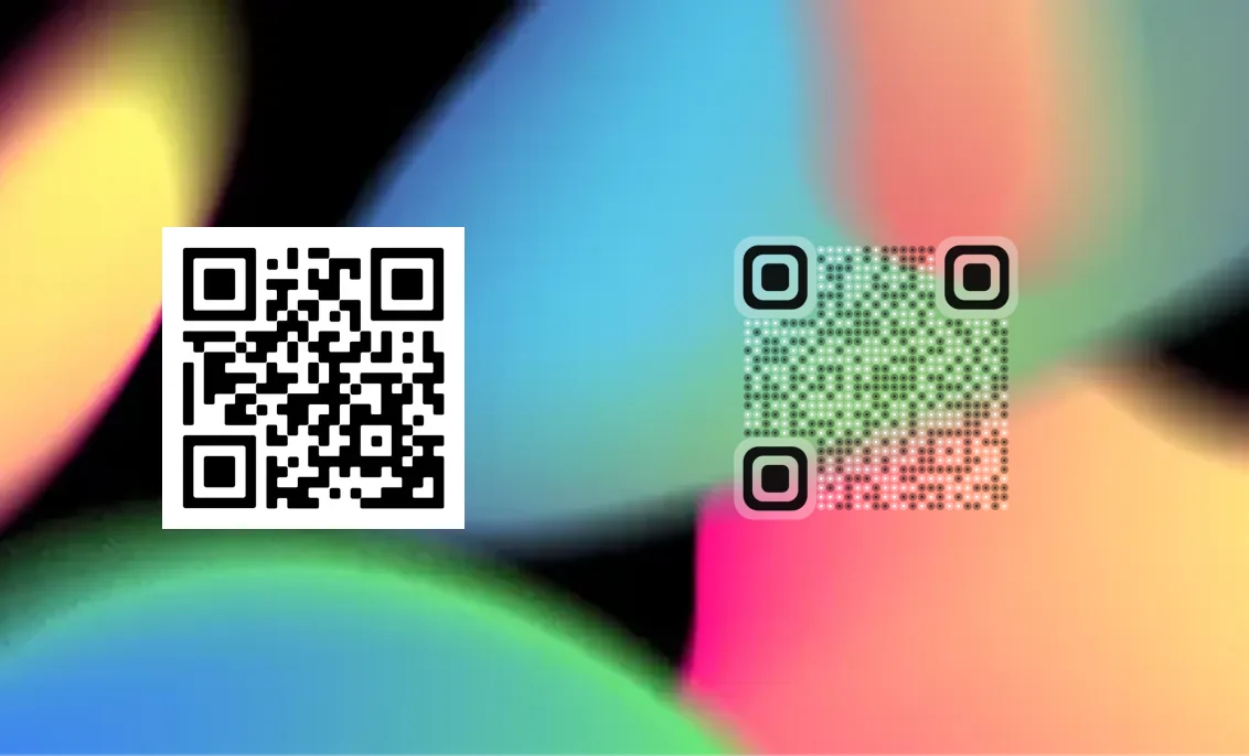
In short: a transparent export is the right tool for a pastel flyer and the wrong one for an album cover. If the background moves from light to dark inside the code area, a single-colour grid cannot keep contrast everywhere, and a scanner needs contrast in every cell.
How does it still scan?
A phone does not read a QR code the way you look at it. It runs a fixed sequence, and both transparent and invisible codes are built around that sequence.
- Find the three corners. The scanner looks for the finder patterns first, in a 1:1:3:1:1 ratio of dark and light. That is why those three markers keep a solid outline no matter how soft the rest becomes.
- Estimate the grid. From the corners it works out the module size and where the grid lines fall.
- Sample each module. For every cell it asks one question: is this darker or lighter than its surroundings? This is the step a transparent code can fail and an invisible one is designed to pass, because the halo answers that question locally.
- Correct errors. QR codes carry Reed-Solomon error correction. At level H up to 30% of the modules can be misread and the data still decodes, which buys room for a few ambiguous cells over a busy photo.
Put it into practice
Try QRCodeKIT Pro free for 7 days and see it work. No credit card required.
Start free trialWhen to use one, and when not to
- Beverage cans and bottles. Wraparound artwork with no flat area to spare.
- Event posters and album covers. One image, one message, no box in the corner.
- Premium packaging and labels. Cosmetics, wine, spirits, speciality food, where the pack is the brand — and where the EU Digital Product Passport will put a code on the pack anyway.
- Magazine ads and out-of-home. Full-bleed photography that a white square would interrupt.
- Murals, exhibition walls and merchandise. Large format, where the box would be the first thing anyone saw.
Where not to use one: receipts, forms, tickets scanned in poor light, or any page where the code is the only element. There a standard code is faster to find, and hiding it gains nothing.
How to make a transparent QR code
- Pick the type and add the destination. Website, menu, coupon, PDF, vCard, app store: every QRCodeKIT type can be rendered this way.
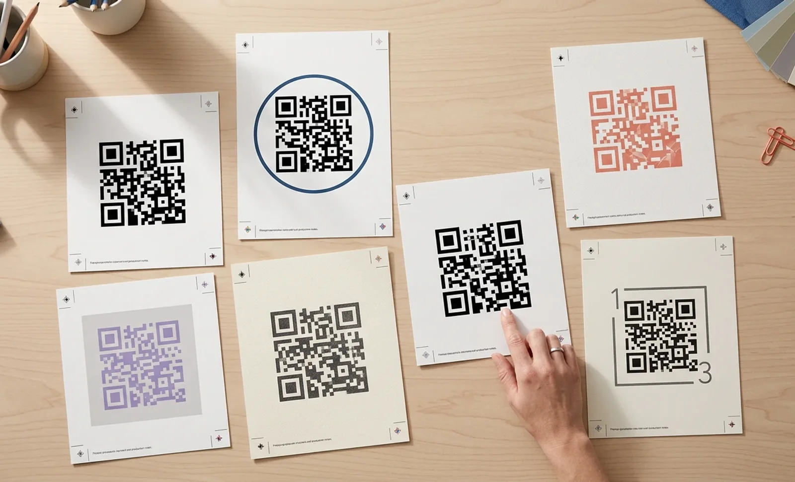
- Choose the style. Standard keeps the plate. Invisible removes it and renders the modules as dots that adapt to the artwork. Pick light dots for dark designs, dark dots for light ones.
- Add a call to action if the context needs one. A short frame such as “Scan for tickets” lifts scan rates on posters, where people do not expect a code. Skip it on packaging, where the code should stay discreet.
- Download as PNG or SVG. PNG with an alpha channel for photo-based layouts, SVG for anything going to a print shop, because it scales without blur.
- Place it in your layout. Drop the file into Figma, Illustrator, InDesign or Canva as a single layer. Do not rasterise it, do not rotate it more than a few degrees, and do not apply effects to the layer.
Design and print checklist
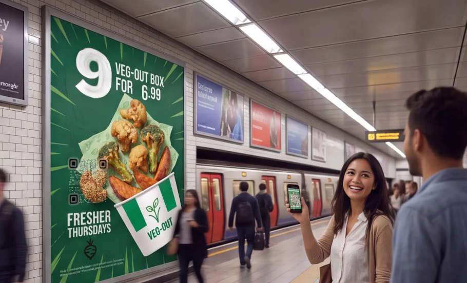
Most scan failures are placement problems, not code problems. Run through this before the file goes to print.
- Minimum size: 2 x 2 cm for anything scanned at arm's length. For posters use the rule of ten, where the code is at least one tenth of the distance people will scan it from. A poster read from 2 m needs a 20 cm code.
- Contrast: put the code over an area with a reasonably even tone. Busy is fine; a background that swings from white to black inside the code area is not. Move the code rather than fight the artwork.
- Quiet zone: four modules of room where no text, logo or high-contrast detail sits.
- Dot variant: light dots over dark artwork, dark dots over light artwork. If the area is mixed, match the tone behind the three corner markers.
- File format: SVG for print, PNG at 300 dpi or more for raster workflows. Never JPEG, which has no transparency and blurs edges.
- Substrate: glossy foils, metallic inks and curved surfaces reflect light. Add 20 to 30% to the size and test on the real material, not on a laser proof.
- Test on phones, not on screen. Print at final size and scan with at least two handsets, one iPhone and one Android, in the light the code will actually live in.
Mistakes to avoid
- Shrinking it to hide it further. Making it tiny only makes it unscannable.
- Putting text inside the quiet zone. A tagline hugging the code confuses grid detection.
- Re-exporting through a tool that flattens transparency. Some print portals convert PNG to JPEG on upload; send SVG or a PDF with the vector intact.
- Recolouring the dots in the design tool. That removes the calibrated halo contrast. Change the variant at source instead.
- Printing a static code. If the destination changes after the run, a static code is scrap.
Where that leaves you
The QR code won because it was practical, not because it was pretty. A transparent export fixes the white box on simple layouts. An invisible code fixes it everywhere else, by making every module carry its own contrast instead of relying on a plate. For anything where the design is the product, that removes the last reason to argue about where the square goes.
Create one, drop it on your artwork, print a proof and scan it. If it reads on two phones in real light, ship it.
Frequently asked questions
Is a transparent QR code the same as an invisible QR code?
Not quite. A transparent QR code is a standard code with the white background removed; the modules stay solid and one colour. An invisible QR code also removes the background, but renders the modules as semi-transparent dots with contrast halos so they adapt to the artwork behind them. Every invisible QR code is transparent; not every transparent QR code is invisible.
Does a transparent QR code scan slower than a normal one?
No. The corner markers are solid and the code uses error correction level H, so a well-placed code decodes in the same fraction of a second as a standard one. Placement and size matter far more than the style.
Which file formats can I download?
PNG with an alpha channel and SVG. Use SVG for anything going to a professional printer, because it scales to any size without blurring.
Can I put my logo in the middle?
Yes. The logo sits in the same central area a standard code would use, and error correction covers the hidden modules. Keep it under about 20% of the code area.
Can I turn an existing QR code transparent?
Yes. Open any dynamic code in your dashboard and change its style. The destination and the analytics stay the same, and printed copies keep working because the data behind the code does not change.
Will it work with the EU Digital Product Passport?
Yes. The passport requires a data carrier on the product; it does not dictate how that carrier looks, as long as it scans reliably.
Related articles
How we compare QR code platforms
Where the figures in QRCodeKIT's platform comparisons come from, how they are verified, what we show as evidence, how often we re-check and how to request a…
How to move your QR codes to QRCodeKIT without reprinting
Moving to QRCodeKIT: what survives from your current QR platform, what to export first, how codes on your own domain switch with a DNS change, and…
QR code custom domain: why the redirect domain should be yours
A QR code custom domain puts your printed codes on a subdomain you own: what the short URL controls, how it makes codes portable, whose domain each platform's…
Try QRCodeKIT Pro free for 7 days.
No credit card required. The original dynamic QR code platform since 2009.